Designing brand identity may be the most challenging assignment for both designer and client. Unlike short-lived print collateral or web, a company’s logo should be an enduring identifier that gains equity over the years. In a trend-driven business such as graphic design the idea of creating a durable, lasting identity that is at once contemporary and timeless can be a tall order.
Let’s be honest. Most logos, even well-designed marks, don’t hold up for more than 20-25 years. There are a handful of iconic logos that have been in existence for well over the quarter century mark. These are time-honored brands that have long been household names. As you’ll see below, these classic identities have evolved over the years but the thrust of the initial design concepts have remained intact.
In a future post I’ll dive more into what makes a truly successful logo, but for now study these classic brand identity evolutions and see if you can pinpoint any common attributes:
Ford Motor Company
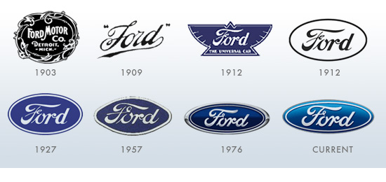
The year was 1902 and Henry Ford had just started his third company, Ford & Malcomson, LTD. A year later the company name was changed to Ford Motor Company and a new logo was designed by Childe Harold Wills. In 1909 the logo was modified to a more refined mark, a unique logotype that has been carried through every Ford logo iteration since. Other than the 1912 divination, Ford has stayed true to its inceptive identity.
General Electric
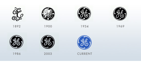
Henry Ford’s old employer Thomas Edison merged his company with Thomson-Houston Electric in 1892 to form General Electric Company. The original GE logo was an hand-rending of the letters “G” and “E” — later embellished with a stylized circle in 1900. As you can see, the GE logo has changed very little over the years — a remarkable feat considering the company’s diversification over the years and its current global breadth.
Mercedes-Benz
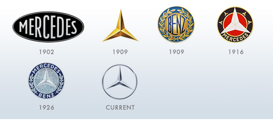
According to legend the 1909 Mercedes logo, a three-pointed star, represented “making vehicles in land, water and sky.” The three-pointed star remains to this day and has become a symbol of luxury around the world.
Coca-Cola
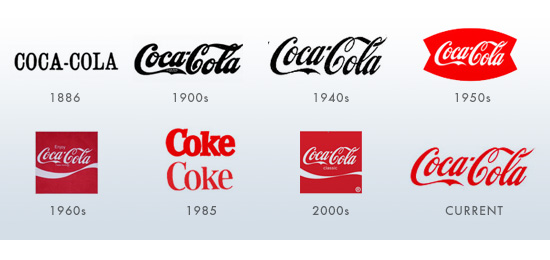
When John Pemberton created the Coca-Cola formula in 1886, his logo was a nondescript slab-serif typeface. A year later he asked his bookkeeper Frank Robinson to come up with a more distinct logo for the company. Robinson crafted the original Coke logo using Spencerian Script, a popular penmanship type at the time. Other than the disastrous ”New Coke” of 1985, Coca-Cola has kept true to its core identity for over 120 year.
Looking to develop a lasting brand identity for your company? Call Engine 8 Design at 406.222.7566 to get started.
© 2011 Engine 8, Inc | Reproduction of this content is prohibited without permission. Linking to this article is allowed with appropriate credit.